Thursday, September 1, 2011

Anish Kapoor Sculpture

1. Research Kapoor's work in order to discuss whether it is conceptual art or not. Explain your answer, using a definition of conceptual art.

“In conceptual art the idea or concept is the most important aspect of the work. When an artist uses a conceptual form of art, it means that all of the planning and decisions are made beforehand and the execution is a perfunctory affair. The idea becomes a machine that makes the art.” - Sol LeWitt (1967)

I think that Kapoors work is conceptual work because it seems to me that he has planned and knows what he is going to make beforehand.


2. Research 3 quite different works by Kapoor from countries outside New Zealand to discuss the ideas behind the work. Include images of each work on your blog.


Sky Mirror (2006)

The ‘Sky Mirror’ is a 35-foot-diameter concave mirror made of polished stainless steel. Standing nearly three stories tall at the Fifth Avenue entrance to the Channel Gardens at Rockefller Center. It presents viewers with a vivid inversion of the skyline reflecting an upside-down portrait of this elegant and iconic New York City skyscraper. I like the idea of this one because you get to see what you don’t normally see when walking around the streets. We often miss the beautiful tall buildings and the open sky in our daily life.


Between shit and architecture. (2011)

He has used a machine that pushes out concrete leaving only gravity to form piles.
Kapoor explained to us, ‘The machine carries on inexorably, but the material does its own thing, so the process in unpredictable.’ I like the idea that he is not in control of any of the formation and he has let the materials form where they may. This shows that he did not know how it was going to turn out or what he had planned. This work is not conceptual.


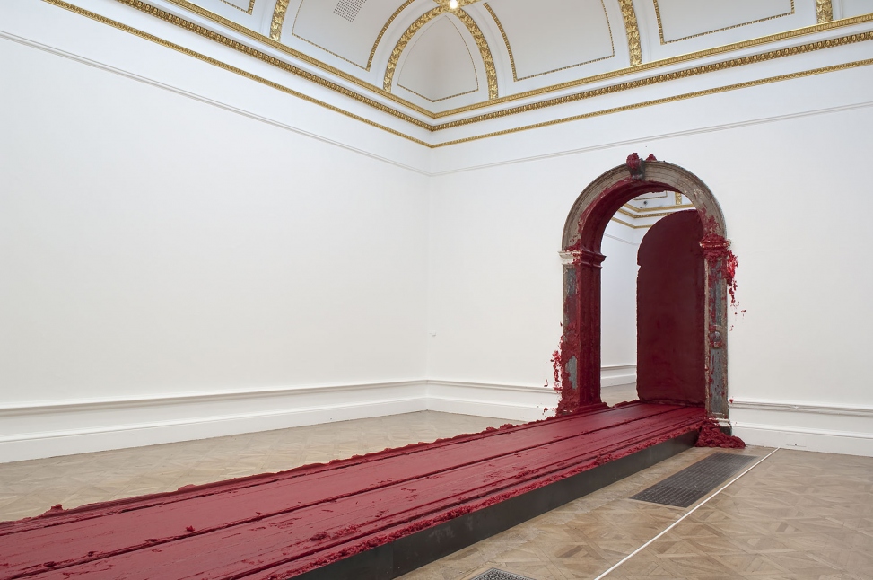
Svayambh (2007) Wax and oil-based paint

“The title is a Sanskrit word meaning ‘auto-generated’. As it passes through doorways that are slightly too small to accommodate its bulk, this huge block of crimson wax will slough off some of its fleshy excess onto the elegant marble surrounds. Instead of acting as a doorway to subliminal experiences, the obdurate lump will barge through actual doorways, leaving messy trail that seems to mock the aspiration of those sculptures seeking to disguise their physicality.” (Material World, 2009, Royalacademy.org.uk)


3.Discuss the large-scale 'site specific' work that has been installed on a private site in New Zealand.

This piece has been named after its site, which passes through a carefully cut hillside, provides a kaleidoscope view of the beautiful Kaipara Harbor at the vertical ellipse end and the hang contoured rolling valleys and hills of “The Farm” from the horizontal ellipse.


4. Where is the Kapoor's work in New Zealand? What are its form and materials? What are the ideas behind the work?

“The Farm”, is an installation on a 400ha private estate outdoor art gallery in Kaipara Bay. It is designed to withstand the high winds that blow inland from the Tasman Sea off the northwest coast of New Zealand’s North Island. The sculpture is fabricated in a custom red PVC-coated polyester fabric by Ferrari Textiles supported by two identical matching red structural ellipses that weigh 42,750kg each. It also creates a kaleidoscopic view of Kaipara Harbor.

5. Comment on which work by Kapoor is your favourite, and explain why. Are you personally attracted more by the ideas or the aesthetics of the work?

I personally really liked ‘Sky Mirror’ because it was placed in a very busy and big environment but as you walk past you are urged to stop and admire this Artwork. It creates such an eye-opening mood and makes you think more about what is around you. I like the idea of the sculpture and how it is so solid and fine but I also am intrigued by the aesthetics of it.


References:

http://www.publicartfund.org/pafweb/projects/06/kapoor/kapoor-06.html

http://www.royalacademy.org.uk/ra-magazine/autumn-2009/features/

http://fabricarchitecturemag.com/articles/0110_sk_sculpture.html

Pluralism and the Treat of Waitangi

1. Define the term 'pluralism' using APA referencing.

According to Caldwell (1999):

Pluralism in art refers to the nature of artforms and artists as diverse. The cultural context of art is all encompassing in its respect for the art of the worlds cultures. Inclusion of individuals of differing enthnicities, genders, ideologies, abilities, ages, religions, economis status and educational levels is valued. Pluralism honours differences within and between equitable groups while seeing their commonalities. (para 1).

2. How would you describe New Zealand's current dominant culture?

I believe New Zealand is very multi-cultural and we accept many different ethnic groups into our Country. Over the past years our culture has defiantly been broadened by globalization and immigration from the Pacific Islands, East Asia and South Asia but European and Maori remain the two largest ethnicities.


3. Before 1840, what was New Zealand's dominant culture?

Maori culture has predominated for most of New Zealand’s history of human habitation. Over the ensuring centuries of Maori expansion and settlement, maori cultire diverged from its Polynesian roots. Maori established separate tribes, built fortified villages, hunted and fishes, traded commodities, developed agriculture, arts and weaponry. Europeans migrated to New Zealand in increasing numbers from the late 18th century. After 1840 and the Treaty of Waitangi, Maori lost much of their land and authority, entering a period of cultural and numerical decline.


4. How does the Treaty of Waitangi relate to us all as artists and designers working
in New Zealand?

I think The Treaty of Waitangi has influenced us as Artists and Designers to look at the cultural side of art and to show our history through our work. It is a great way to show our independence and unique culture.

5. How can globalization be seen as having a negative effect on regional diversity in New Zealand in particular?

New Zealand’s culture has been taken by many Artists and used for many different reasons. For example, designer Jean Paul Gaultier has taken the moko to promote his latest collection. This has no connection to New Zealand culture but he has taken this as an aesthetic look.


6. Shane Cotton's paintings are said to examine the cultural landscape. Research Cotton's work 'Welcome'(2004) and 'Forked Tongue' (2011) to analyze what he is saying about colonialization and the Treaty of Waitangi.


According to John Daly-Peoples (2010), Cottons work “Forked Tongue”, which features a cliff face, a fantail, some Maori designs and a tracery of red lines these symbols or metaphors become starting points for an elaboration on the links between the physical, historical and spiritual landscapes.

“Landscape references in Cotton’s early paintings recall the symmetry of Maori carving and the work of Colin McCahon. Simple images, sepia-coloured and scaled metaphorically, derive from nineteenth-century Maori Folk Art, which Cotton perceives as signifiers of Maori culture cleverly veiled within a Christian context.” Biography, (n.d), thearts.co.nz.


7. Tony Albert's installation 'Sorry' (2008) reflect the effects of colonization on the aboriginal people of Australia. Research the work and comment on what Albert is communicating through his work, and what he is referring to. Describe the materials that Albert uses on this installation and say what he hopes his work can achieve. Define the term 'kitsch'.

‘13 February 2008 is an historic date etched into Australia’s national memory. On this day, Australia witnessed one of its most overtly optimistic displays of unity and national pride, when Prime Minister Kevin Rudd offered a formal apology to Indigenous Australians. It was a day when, in the eyes of many, the country grew up.’ Tony Albert, (n.d), Queensland Art Gallery.


Albert has tried to capture this emotion and introduced us to a forest of faces, each sharing elements of history with those stolen from their people, land and culture. He presents the audience with a simple word, bold letters on a wall, indicative of an indigenous Australian response to the apology.

Kitsch is a form of art that is considered an inferior, tasteless copy of an extant style of art or a worthless imitation of art recognized value. The concept is associated with deliberate use of elements that may be thought of as cultural icons while making cheap mass-produced objects that are unoriginal.

"The Sorry work is about my personal collection which, in a way, was always a comfort to me. There were images of Aboriginal people around me and my collecting these objects was my way of marking my respect." (Tony Albert, n.d)

8. Explain how the work of both artists relates to pluralism.

Both of these Artist make you think more about your own country and your heritage. They help us look at the positive side of history and we should be proud of where we live. You also see how different and unique cultures really are.


References:

http://www.nbr.co.nz/article/shane-cotton-paintings-examine-cultural-landscape-126412

http://en.wikipedia.org/wiki/Culture_of_New_Zealand

http://www.nowpublic.com/culture/cheeky-french-steal-moko

http://thearts.co.nz/artist_page.php&aid=24&type=bio

http://www.youtube.com/watch?v=_Drb9RbW3Tw

http://en.wikipedia.org/wiki/Kitsch

http://www.theaustralian.com.au/news/arts/curios-of-the-contemporary/story-e6frg8n6-1111119151528


Tuesday, August 16, 2011

Kehinde Wiley and inter-textuality

"Intertextuality is the shaping of texts' meanings by other texts." - wikipedia, (n.d), Retrieved August 10, 2011 from http://en.wikipedia.org/wiki/Intertextuality

Intertextuality is when you have a piece of Artwork/writing and find similar qualities in it from another piece of work that makes you understand it more. A lot of Artists these days are doing so as they try to reproduce an Artists work.


Wiley's portraits are based on photographs of young men who he sees on the Street. His models were asked to assume poses from the paintings of Renaissance masters. "He creats a fusion on period styles, ranging from French Rococo, Islamic architecture and West African textile design to urban hip hop and the "Sea Foam Green" of a Martha Stewart Interior colour swatch.(Wikipedia.com, n.d)


"Pluralism in art refers to the nature of artforms and artists as diverse. It honors differences within and between equitable groups while seeing their commonalities." ALVC.2, Caldwell (1999), Page 46 Para 1. You see this in Wileys work as he uses the influence of "Old Masters" in his portraits of African American men.


Wileys work creates a lot of interest in a way that develops questions. "Wiley engages the signs and visual rhetoric of the the herioc, powerful, majestic and the sublime in his representation of urban, black and brown men found throughout the world." KehindeWiley.com,n.d. For me stereotypes show in Wiley work how he has used African American men, dressed them in normal "gangsta" clothing and placed them in a high classed power setting. This gives us many questions in what he is trying to portray in these images to the audience.


Monday, August 8, 2011

Hussein Chalayan


Afterworks (2008) was inspired by the horror having to leave your home at the time of war. After talks with his family Chalayan explored the ideas of how we may want to hide our possessions or how we may want to carry them with us on departure in such an ordeal.


Burka (1996) is very thought provoking. It Challenges us with ideas such as modesty, identity and feminity. Chalayan presented models wearing different length burka inspired creations with nothing underneath them, with some models being completely naked except from a mask and sandals. This ability to stay relevant to society this many years on is what makes Chalayan's work stand out above many other designers.


'Afterworks' and 'Burka" both have meanings behind them and stand out very clearly. When seeing these works I see the person inside them as well as what he is trying to portray. Fashion these days is just about the lastest trends and making an image that everyone seems to follow. Chalayan's work is not just creating clothes he creates ideas and works or art that forever cross the line between art and fashion.


The level Tunnel (2006)
Chalayan has created an installation to help advertise Level Vodka. I believe that this is still art in a way that shows different ideas than normal artists. It interacts with the audience and gives them an experience like all art installations do. "The individual going through the tunnel might feel like they are able to feel the smell or taste the sound resulting in a synaesthetic experience." It is not only trying to sell a product but also showing a piece of Chalayans Artworks. Chalayan is taking a step further and working with promotional companies to make his work.


Absent Presence - 2005 venice Biennale


I personally think that it is not a big deal if you do not make the artwork or clothing yourself. A lot of Artists are making such big artworks that they need help to make it faster. I still believe that it is all coming from that Artist. They are the one that thought of the idea and planned it all out. When looking at a piece you are not thinking of how they made it you are thinking of the concept and ideas that comes with it. In the fashion industry they have different people for everything. The designer might not be a sewer so they have someone to do that just but they still came up with the ideas and patterns. On the other hand as a painter you should be able to do your own pieces yourself. In my opinion getting someone else to do your painting will never turn out the same as your own.

Sunday, August 7, 2011

Post modernism, Ai WeiWei and Banksy

Post Modernism:
- an art movement which was thought to be in contradiction to some aspect of modernism.
- it is a tendency in contemporary culture characterized by the problem of objection truth and inherent suspicion towards global cultural narrative or meta-narrative.
- The period in which we now live in is often called "post-modernism".
- something which evolved after 1968
- the term is used in philosophy, literature, social sciences and architecture.
- composed by two parts "post" and "modern". "post" is latin for "after", and "modernism" refers to the modern period.
- It was during Postmodernism when we started to see an “indifference to social concerns.”
- Post modernism partakes of uncertainty, insecurity, doubt, and accepts ambiguity.
- It is very closely synced to what “is also called New Age thinking.”

"The post-modern artist is "reflective" in that he/she is self-aware and consciously involved in a process of thinking about him/herself and society in a deconstructive manner, "demasking" pretensions, becoming aware of his/her cultural self in history, and accelerating the process of self-consciousness." Witcombe(2000)

During the post-modernism, people started to agree on "social and cultural pluralism". After there was an "attention to play of surfaces". People started to adapt to "simulation, visual media becoming undifferentiated equivalent forms." "hyper-reality" became much more powerful than the "real" images. There was also mixing of "pop culture" and "hybrid cultural forms". Art started to "authenticate by the audience" rather than just ny the "artist".

Ai WeiWei Han Dynasty Urn with Coca-Cola Logo.


Ai WeiWei is one of Chinas earliest and most influential avant-garde artists. He is a self-taught artist who sparks the modern art movement in Beijing. He is influenced by Dad, Duchamp and Warhol by creating provocative and subversive photographs, installations and sculptures.


Banksy uses stencils to make statements about everything from war to politics, big business, government oppression, and the mess we're making of the environment. "Does the image mean we are powerless? Flowers are so ephemeral, so fragile. How could they possibly hurt anything? Or are the flowers a symbol of the intangible power that comes from belief and hope and that certainty of truth?." (Tommi Lou Carosella, n.d) It is also very interesting the way Banksy shows his work. A way that many people don't like and think it is vandalism. I think it is powerful and makes people look at it in a different way to what they would see if it was in a Gallery.


In 'Los Angeles'(2008), I see a cave man/ape holding a bone in one hand and a tray with fast food on the other. This is very interesting because you would never see an ape/cave man and also you would never see one holding a tray of fast food. You see a lot of ideas like this in Post-modern art as artists are now looking further into making things without meaning.


References:

http://www.artzinechina.com/display_vol_aid109_en.html
http://arnica.csustan.edu/carosella/banksystreetart/street_art_by_banksy.htm

Tuesday, July 26, 2011

Week 1, Nathalie Djurberg's 'Claymations'

Claymation is a service mark used for an animation process in which clay figurines are manipulated and filmed to produce an image of lifelike movement.


What i think the term 'surrealistic Garden of Eden' means is that Djurberg's installation experiment is oddly dreamlike and unreal. She has almost created her own 'Garden of Eden' from hell. The term 'all that is natural goes awry' means that what we expect and what we think is normal it will be the totally opposite. Djurberg creates things that people wont expect and will get us thinking about the unreal.


Djurberg confronts us with many different'Complexity of emotions'. The stories deal with topics such as war, violence, sexuality, sadism ans assault in an investigation of the darker side of the human soul. Their sexual and sacrilegious encounters are just pretext to highlight preserve games of power and submission. AS the catalog of biennale says : through these minutely composed sequences of stop motion animations, djurberg toys with societies perceptions of night and wrong, exposing our own innate fears of what we do not understand and illustrating the complexity that arrises when we are confronted with these emotions.


Djurbergs stop-motion animations are hand-modeled plasticine puppets. They almost remind me of TV programmes when i was little. Djurberg's stories have a lot in common with traditional folktales. They deal with archetypical themes and involve traditional roles as the good, the bad and the kind helper. The films also have animals as characters e.g. the wolf, the bear and the tiger. As in tales strange and magical things happen in Djurberg's films; animals speak, trees walk and humans fly and talk with animals. Like in traditional tales the films have shocking and gruesome elements which occur after the narrative turning-point in the story. After this turn of events the films no longer look like children's TV ­ but rather as a scary x-rated fantasy without any moral.(Helle Ryberg, curator, 2005)


Artists are always looking for different ways to capture and inspire their audience and i think this is why they are so interested in turning something innocent and sweet into something disturbing. It shows they are thinking in different ways and go beyond what we expect.


Djurbergs work is very disturbing but i was very intrigued by all her work. Her work is very different from any other artists and show many different stories and emotions. The music by Hans Berg in the films is dominating and with its almost psychopathic cheerful rhythm it hints to the fact that there's something wrong. The music she also uses creates a set mood for the audience to feel they are apart of the work. You almost get into a mind set of what is happening around you.


References:

http://we-make-money-not-art.com/archives/2009/10/nathalie-djurberg-who-won-the.php
http://we-make-money-not-art.com/archives/2008/04/there-are-very-very-few.php
http://www.designboom.com/weblog/cat/10/view/6886/nathalie-djurberg-experiment-at-venice-art-biennale-09.html
http://artnews.org/artist.php?i=1211
http://www.thefreedictionary.com/Claymation

Monday, May 30, 2011

Modernism and Post-Modernism

Both Claude Monet and Chuck Close were exploring paint, color and human perception. Research the work of both artists in order to;


1. Outline the intentions of each artist.


Claude Monet was founder of The French Impressionist painting, and the most consistent and prolific practioner of the movement’s philosophy of expressing ones perceptions before nature.


Chuck Close has studied the human head in both painting and photography; he has transformed our understanding of portraiture and carved out a unique space in contemporary art. The ’scanning experience’ he describes has always been facilitated by Close’s uses of the grid, which allows the artist to make a leid of geographical survey of the face. 


2. Describe the techniques of each artist


Impressionist’s painters have a specific way of using colours. As most impressionists, Monet uses his own palette to paint shadows and rarely uses black. Monet obtained an appearance of black by combing serveral colours: blues, greens and reds.
At the beginning of his career, monet used dark colours, as he did in the ‘studio corner’ marked by black shades. From 1860 on, monet abandoned dark colours and worked from a palette limited to pure light colours.

Close's work is made by a grid brought to the foreground, creating a cadenced space of 2.5inch cells. These cells are made by abstract and biomorphic shapes, from gooey lozenges and lopsided bubbles to more geometric rods and circles. The shapes often traverse across two or three cells, or conjoin in L-shapes. 

3. Find 2 quotes about each artists work, and reference them correctly.


“As for the colours I use, whats so interesting about that? I don’t think one could paint better or more brightly with another palette. The most important thing is to know how to use the colours. Their choice is a matter of habbit. In short, I use white lead, cadmium yellow, vermillion, madder, cobalt blue, chrome green. That’s all.”
The Colors of Monet. (2006) Retrieved 30 May 2011 from www.intermonet.com/colours/

“No one is an artist unless he carries his picture in his head before painting it, and is sure of his method and composition."
Claude Monet Quotes . (2001) Retrieved 30 May 2011 from www.brainyquotes.com/author/c/claude-monet.html

“I was trying to rip it loose of the context in which we normally saw portraits and normally saw people, and try to make it a scanning experience, and experience of stumbling through this landscape.”
Chuck Close: Family and Others. (2007) Retrieved 30 may 2011 www.whitecube.com/exhibitons/close/paintings-i/

“Artists…see both the device that make the illusion and the illusion itself. Im as interested in the distribution of marks on a flat surface..as I am with the thing that ultimately gets depicted..[its] shifting from one to the other that really interests me.”
Chuck Close. (2000-2001) Retrieved 30 May 2011 from
 http://www.worcesterart.org/Exhibitions/Past/close.html

4. Note 3 similarities of the work of both artists.


The colours are very bold and also soft.
The brush strokes used are very similar, almost like a circular motion.
The texture gives life and emotion to the paintings.

5. What are some differences between the artist's work. (at least 3)


Monets work is a lot more realistic and softer than Close’s
Close uses a very unique method of painting to show the image. He has done each square individually and uses many different colours in each.
Chuck Close focussing more on people and detail of their face where as Claude Monet is nature and reflection. 

6. Describe your response to the work of both artists.


Chuck Closes work is very fascinating, I like the way he looks at detail and shows it in a different way. It is very stimulating in the way he paints. Also, the scale he uses for his image is massive.
Claude Monet on the other hand has amazing brush strokes in his work. It is so light and soft but very detailed. The colours he uses and the blending of different colours is very unique. 


www.intermonet.com/colors/
www.brainyquotes.com/authors/c/claude-monet.html
www.whitecube.com/exhibitions/close/paintings-i/